Tabor Academy Viewbook: "What WE means to ME"
About the entry
What is innovative about this effort is that this admissions viewbook is not a catalog; it is a story of the opportunity possible within a uniquely supportive community. When Tabor Academy says supportive, it is not talking about academic support (though there is plenty of that), but the support one gains from being with truly supportive and ambitious friends. With this book, Tabor Academy puts its stake firmly in the ground of community, aiming to represent its unique culture from the start in hopes of attracting the right applicants: the kind of people who know people go further together.
From the Judges' Report
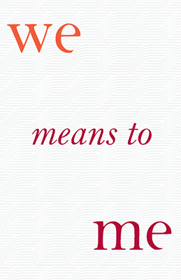
For the folder, we loved the surprise of Welcome and We/Me—there were verbal “oohs” and “ahs.” It was so clever and creatively executed. Just the idea of We/Me was thought provoking and inspiring— and the idea was clearly proven and represented throughout the piece.
The overall design is modern, sophisticated, timeless. The color choice of red and orange was a bold move—making this piece striking. There were lots of nice surprises in the brochure. On the cover, the waves were elegant and a wonderful nod to the proximity to the ocean. Inside, we loved the center foldout and infographics. Great photography and elegant captions.
We suggest that the brochure would have been even nicer if the mini booklet on the cover was a pullout takeaway piece—or perhaps it should have just been one page because it felt bulky and unwieldy. Those small pages were hard to hold open and flip through while holding the bigger brochure. But, clearly it didn’t take that much away from the overall piece because it is definitely Gold worthy!