
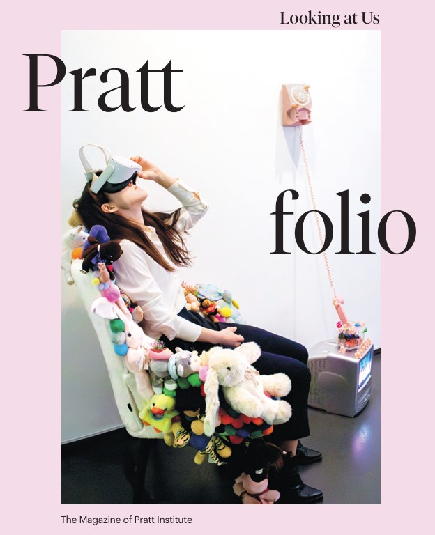
Prattfolio Design Refresh
From the Nominator
Bigger energy, bolder imagery, more ways of connecting with Pratt—these were the ideas that guided the editorial and creative team behind Prattfolio, Pratt Institute’s magazine, in the publication’s first design refresh since 2016. After a digital-only hiatus during the pandemic, we returned to print and then set the refresh in motion. At a moment when we are more online and screen-bound than ever, the print piece felt charged with potential. Following a year and a half of research and collaboration, our in-house team brought the new look and content to readers in an issue dedicated to our community. We wanted it to be a genuine gift to all the people who make Pratt what it is. This project also followed Pratt Creative Services’ visual identity refresh for the Institute. We incorporated elements of the new visual identity and drew inspiration from its underpinnings, reflected in typographic and color systems. We updated the magazine’s content to reflect the creative and intellectual activity of our community, from students to faculty to alumni. The result was enthusiastically received, with academic colleagues saying the refreshed magazine “immediately connects me to Pratt,” with “more ways to engage,” emphasizing that “this is what we need to be able to show our students.” Senior administrators noted its impact and staying power, saying they saw Prattfolio in galleries and among the glossy art and design magazines in alums' collections.
From the Judges
A very successful redesign that is subtle in many ways but very powerful. Judges loved the enlarged font for text and the encouraging of community involvement. The panel agreed that the redesign is visually striking and in-line with Pratt's ethos, making it more accessible to its readers on several levels.